Monday, September 19, 2011

What a Difference a Pearl Makes....


This is a hybrid card utilizing both digital imaging and “live” accents. The template of this card is not one which I would have put together on my own, but was “nudged” to try it by a fantastic card from my sister’s place. This card also gave me the opportunity to use a plethora of decorative pearls; though I love the pop which rhinestones bring, sometimes they are too sparkly for a card. In these circumstances, substituting a pearl for a rhinestone is the perfect solution.

I also layered some ribbon. Unfortunately, I don’t think it was very successful. How should I have done it? What would have worked better? Leave me a comment and let me know your thoughts.


Recipe: Flower Fancy, Oval All, and vine (MDS) stamp sets, Old Olive, Night of Navy, and Whisper White card stock; Night of Navy and Old Olive ink; Small Oval punch; 1/2” Old Olive Satin and 1/8” Night of Navy Taffeta ribbon; Jewel Basics: Pearls; dimensionals.

Friday, September 16, 2011

Less is More


Here is my first example of inspiration in action. I love the simplicity of this card – the pops of purple against the white plane. Add in the perfect embossing and a beautiful card emerges. As far as the sentiment is concerned, I have seen this stenciling technique on several different projects around the “crafting circuit” and have wanted to give it a try. The heart was the perfect shape – I was thrilled how perfectly the sentiment fit (even the curve from the “v” follows the contour). I think it was the perfect way to add just a little more of the Sahara Sand pop of color.

Recipe: Well Scripted stamp set; Elegant Bouquet embossing folder; Sahara Sand, Concord Crush, Whisper White card stock; Heart, Three Hearts, and Itty Bitty Shapes punches; Jewels: Basic Pearls; sponge; mini glue dots.

Thursday, September 15, 2011

Back in the Saddle Again…

Take a visit to my sister (chalked full of more lovely card/crafting projects than one could think of) and mix in the need for an outlet and what do you get? NEW CARDS! Stay tuned for some new “lovlies” on the way.

Thursday, August 25, 2011

Drumroll Please….

Though I do love orange (the color, not the “animal”…oh, I guess I do like the “animal” too *wink*), that is not correct. If you have seen my office, then you would probably guess that it is blue – and you would also be incorrect. Here it is:


YELLOW

I love yellow; it is my absolutely favorite color in the entire world!


Now that we have gotten off on a tangent, it is time for me to fill you in on how this all works together. Remember yesterday when I said I found some inspiration at my local crafting store? Well, I was walking down the paper isle (paper pads were 50% off, so I couldn’t pass it up) and there, among all the flowers and shapes and baby and holiday and so many other miscellaneous and unappealing to me at that time stacks of paper was a gem:


Lemon Flower Stack – various 12x12 patterned papers utilizing black, white, yellow, and green colors with some accents of silver glitter and embossing. I snatched it up and vowed to get back to crafting.

Stay tuned for some of my Lemon Flower projects.


Wednesday, August 24, 2011

It Doesn’t Take Much…


Well, as you know, I have been neglecting my little blog for a little while now. As I walked through a local craft store over my lunch hour today I found it – the perfect inspiration to give me a swift kick in the fanny. Yes, I know you are wondering what this clever crafting concoction is, but you are just going to have to wait a bit.


As you may or may not know, my favorite color combination is…you guessed it…black and white. Look at them there…perfectly offsetting each other…like peanut butter and jelly…like ham and eggs…like cookies and milk (and yes…I am a little hungry, but that’s not the point)…. Now, what could make it better? One more pop of color…what could it be…what could it be?

If you think you know, then leave me a comment. Check back tomorrow and see if you are right.

Tuesday, August 02, 2011

A Dilemma and Collaboration


I needed to make some Thank You cards (“some” meaning “lots”) which creates a big dilemma: how do I stay true to my style of creating yet tone it down enough to create several duplicate cards?

I had an idea as to what I wanted to do. This idea was inspired by a beautiful card I saw on the Inspiration in Action blog. Gretchen used the new large doily stamp from Stampin’ Up! to create a stunning card. From this card I gathered inspiration for the color combination as well as for the layout. If I had it my way (and lots and lots of time), then I would make this exact card fifty times, but that wasn’t too practical for my current project. What to do? What to do?

Lucky for me, my mother came to visit this past weekend and I took advantage of her creative eye (and fingers and super skill with MDS). With her great help, I was able to nail down a design that not only reflects my inspiration card, but also was practical to replicate many times.

I haven’t used Stampin’ Up!’s My Digital Studio (MDS) very much, so I really leaned on my mother’s skills with it. I really enjoyed how much it streamlined the creation of this project. First, instead of stamping one hundred and fifty petals, I simply printed them out on my color printer and punched them out. Second, I was able to find the perfect sentiment and customize the size to fit my card. Finally, I was able to customize the polka-dot background image with Lovely Lilac (a retired color for which I still have cardstock, but not any coordinating DSP).

I really like the final version of this card; I may even duplicate it even more with various color combos…one to fit which ever mood I may be in at the time I give one away. Who knows, you may even get one….


Recipe: Watercolor Trio, Build a Blossom, and Hip and Handsome Overlays digital stamp sets; Concord Crush, Lovely Lilac (this is a retired SU color, but it is similar to the new Wisteria Wonder), Whisper White, and Certainly Celery card stock; blossoms petal, 1/8” circle, and Itty Bitty Shapes Pack punches; two way glue pen; mini glue dots; My Digital Studio.

Tuesday, July 26, 2011

Who can count the Bs?

Our Creative Corner has done it again – another exciting challenge. This time around the challenge was to create using “All the B’s.” As examples, Sarah listed black, bling, buttons, and bows. What do you think of my entry? Can you recognize all of the “B” items?

I’ll give you a moment to check….


Have you got them all?

Ok, here they are:
  1. Black
  2. Button
  3. Bow
  4. Bling
    (these four were on Sarah’s list of possibilities)
  5. Birthday
  6. Bumps (referring to the heat embossing)
  7. Burgundy
  8. Blow out your candles (part of the stamp)
  9. Binding (since the ribbon wraps three layers together)
  10. Bam! (that is for the “different” card opening…with contrasting DSP inside)

I think that is it; did I miss any?

(I apologize for the quick post and the not so great photo; add to the list “blurry and bloodshot” to describe my eyes and “bed” as my next destination.)


Recipe: Borderline and Take a Spin stamp sets; Basic Black, Whisper White, and Bravo Burgundy cardstock; Night and Day Designer Series Paper; Burgundy dotted paper; Versamark ink; black embossing powder; Boho Blossoms, Perfect Blossoms, and 1” circle punches; narrow black grosgrain ribbon, Bravo Burgundy Stampin’ Write Marker; Regals Buttons; Rhinestone brads; Game Spinners; Jewels: Basic Rhinestones; dimentionals; mini glue dots.

Monday, July 25, 2011

A Little Birthday Inspiration


My brother-in-law just had a birthday (Happy Birthday Liang!) and I was trying to figure out what kind of birthday card to make for him. I remember seeing a color challenge that included two of Stampin’ Up!’s new In Colors, Island Indigo and Pool Party, and grey; I thought this would be perfectly suited for his card.


As I thought about which stamp set to use, I came across the best dog set…unfortunately I don’t know what it’s called or from what company…and knew it was perfect. At this point I wasn’t sure about much else besides the colors and the stamps. I remembered that my sister sent me some pictures (she was happy with my bedding-to-card pictures and thought I could draw inspiration from her pictures) so I looked through them and think I found the perfect match:


I like the blocking of the rug and how the white of her dog, Sally (not Daisy, right Eileen?), pops against the colors. I used that idea for the format of my card. With a little help from SU’s My Digital Studio, I was able to find the perfect sayings and get them onto paper (in the proper color…I love that) and work them in. I also love the manner which the card opens - using the dog's nose to hold it closed...love it:


After completing the card and looking over it next to the picture I realized that I could make one more comparison: texture. I added the diamond plating embossing to the blocking section of the card to add an additional element of interest/texture, but can now see that they could resemble the toy cars which are also placed on the rug. Who knew, right?


How else do you think the toy cars could have been “worked in” to the card?


Recipe: Ruff (since I don’t know the real name) stamp set; Island Indigo and Pool Party patterned paper; Basic Grey, Pool Party, and Whisper White cardstock; grey textured paper; Island Indigo classic ink; Versamark ink; white embossing powder; diamond plate embossing folder; sponges; My Digital Studio; dimentionals.

Wednesday, July 20, 2011

Copenhagen to the Rescue

As if on cue, Our Creative Corner ended my search for some new inspiration. Since I chose to search for new inspiration, I sat down at the computer to see what I could find. And there it was – Our Creative Corner’s Copenhagen Challenge: draw inspiration from any/all pictures posted of Copenhagen AND not to use any pre-printed patterned paper (If you have read my blog more than a couple time, then you know how much of a challenge the last stipulation is since I LOVE PATTERNED PAPER). Above are the four pictures which were provided.


Have you figured out which picture I chose as my inspiration? That’s right (I’m assuming, of course, that you got it right…you guys are so smart), it is this picture:

This interpretation of the picture of the waterway (if you know what it is, then please let me know; it would help “round out” my story) is pretty literal, but with a few “Nichole” flairs thrown in:

Color: I picked out the colors of some of the row buildings along the left side of the picture. I love how that one blue building (at least it appears blue to me) just pops against the earth-tones of the other buildings. I mixed these colors with the grey of the boats and shadows and the water reiterated my blue choice.

Shape: I love how the row of buildings create a “soldier-like” feel to the picture; I wanted to bring that into my card. I decided to extend these the full height of the card (as opposed to cutting them short…maybe adding roofs….). Also, though I am sure that the buildings are square, with the angle of the photo and the shadows created, they almost appear to be slanted slightly; I brought this slightly askew feeling to the “buildings” on my card. Finally, I tried to mimic the angle of the waterway/pier with the rolled grey paper and “peek-a-boo” blue in the lower right corner of my card.

Accent: the white window casings add so much interest to the photo that I knew I wanted to tie that into my card as well. I have had these vanilla tag holders for a while (maybe a year, I think) and have never used them. I was glad when I tested them with my card and saw how they added just the right abstract windows to my buildings.

Texture: I applied two different textures to this project. The first is sponging (again – LOVE IT); I added grey sponging to the outer edges of my buildings as well as the edges of my mats. The end result is more of an aged and muted look which is exactly what I wanted. The other is the Sunburst embossing pattern along the buildings; I think it adds just the right amount of interest without detracting from the other elements of the card (almost mimicking the ripples in the water).

What do you think? Did I do the photo justice? How would you interpret this photo differently?
I’ve never been to Copenhagen, but after emersing myself in this one picture, I would love to see more (and maybe, one day, visit).


Recipe: Edgy Eloquence stamp set; Going Grey, Bashful Blue, Cajun Craze, More Mustard, and Daffodil Delight cardstock; Going Grey classic ink; Hodgepodge Hardware: Stylized Vanilla; Sunburst embossing folder; sponge; inspirations courtesy of Copenhagen via Our Creative Corner.

Tuesday, July 19, 2011

Final Bedding Inspiration

So, I was recently told that I get my inspiration from the strangest places (thanks ladies…). Agreed – who would have thought that I would get inspiration from bedding sets? This is my last “inspired by bedding” card for you (well, for now…until I get a new catalog in about a week). This is my favorite of all; can you guess why?


For starters, I love the colors…or lack thereof…of black and white. The contrast is amazing and, as anyone who knows me can attest, seldom does a day go by when I am not sporting both black and white in my attire (…and have you seen my craft studio…hello…!). Another reason I love this card is the style: it is very, what I want to call, “punchy” with the layout and the color blocking. This is very much my signature. The final reason I like this card is because it brings together various patterned papers – oh, how I love a good pattern.

Do you have a favorite color combination?
Seriously, I think black/white runs my life: at my office, in my studio, on my clothing, everywhere!

Recipe: Thank You Kindly and Ornate Blossom stamp sets; Whisper White and Basic Black cardstock; white and black embossing powder; Versamark ink; Night and Day designer series paper; silver mirrored cardstock; 1¼ 1 ½ 1¾ circle punches; dimensionals.

Sunday, July 17, 2011

Pattern vs. Texture


This is always a struggle for me: should I use a patterned paper or should I add some texture; does anyone else have this dilemma?

This was amplified when I was looking through a catalog (click here to read about my experience with the catalog) and saw this Chenille bedding:


My first thought (in my attempt to transform this bedding into a card) was that it would make a wonderful monochromatic card: layers of paper with pops of the butterflies. So, I looked at my paper and though, “Which color should I pick?” After looking through all of them, I realized that yellow would be the perfect color (which is probably why they chose to highlight the yellow bedding in the catalog). I gathered up the supplies and then was faces with that same issue: do I use patterned paper to create the layered effect or do I emboss?
Since I couldn’t decide between the two, I chose to make one of each and see what you, my wonderful blog readers, thought. The card on the left is the patterned paper and the card on the right is the texture.

Which do you prefer: Pattern or Texture?

Recipe: So Saffron cardstock; So Saffron Designer Series Paper; vellum; So Saffron and More Mustard classic ink; Leafy Branch and Perfect Polka Dot embossing folders; Butterfly punch; Jewels: Basic Rhinestones; sponges; dimentionals.

Thursday, July 14, 2011

Sources of Inspiration


About a year ago I purchased some bamboo curtain panels for my kitchen from an online store; ever since, I receive their bi-weekly catalog like clockwork. Typically, it gets tossed directly into the recycling. However, before repeating the process upon receiving it earlier in the week, I browsed through it (making sure there wasn’t anything new since two weeks ago) and realized that inspiration can come from anywhere…yes, even this catalog I get every two weeks.


This card was inspired by this bedding set (and yes, it is 40% off and comes in sage green and caramel as well):


I attempted to mimic the pleating on the left-side of the card panel, but it did not come together as I had hoped. Instead, I scored the cardstock in alternative directions and I like the overall effect (click on the image to get a better view of the detail). I also love the pink/brown/white color combination (each time I see it I am reminded of my brother-in-law’s wedding…it was gorgeous).

Lucky for you, I will be sharing more of my “annoying catalog” inspiration over the next few days. Come back and see.


Recipe: Simple Friendship stamp set (via My Digital Studio to customize the size/color); Blushing Bride, Early Espresso, and Whisper White cardstock; Itty Bitty Shapes punch; Jewels: Basic Pearls; Crumb Cake Stampin’ Write marker; mini glue dots; bone folder.

Friday, July 08, 2011

A First Attempt

If you have been around the “crafting” block, then you have seen that ribbon scrunching (well, I’m calling it that – there may be a more technical name for it out there) is just about everywhere. I hadn’t tried it before, so here is my first attempt – how’d I do? I can say one thing: it is a lot more difficult than it looks (especially if you are as meticulous as I am about it being “just right”…).

What else do I like about this card? The accents on the animals (shocker, right?). I saw similar cards floating around cyber-crafting-space and thought they were cute, but flat (and I mean that in the best possible way). I was sorting through some of my accessories, to fill my new Stampin’ Up accent holder, and these two corduroy buttons were side-by-side and I thought, “That would be a cute lion head,” and voila! The stamp set came out and the hunt was on to find accents to fit a couple more animals and the rest, as they say, was history.

I LOVE THIS CARD!!!

Let me know if you love it too.


Recipe: Fox & Friends, Just Believe, and Smarty Pants stamp sets; Chocolate Chip, Crumb Cake, and Whisper White card stock; Pumpkin Pie, Daffodil Delight, and Crumb Cake classic ink; Versamark ink; Pumpkin Pie, Daffodil Delight, Crumb Cake, and Chocolate Chip stampin’ write marker; Perfect Accent – Pearls; corduroy buttons; large grommet; Boho Blossoms punch; Chocolate Chip wide striped ribbon; paper snips; Sticky Strip; mini glue dots; stampin’ dimentionals; Crop-o-dile; sponge.

Thursday, July 07, 2011

The "Vacation" is Over

If this is the first time you have visited my blog, then Welcome and a big Thanks for taking the time. If you have visited before, then Welcome Back!

After an overly extended break from blogging (and, unfortunately, paper crafting as well), I am glad to say that I am making time again to do what I love: creating and sharing with friends.

What better way to get back in the swing of things than with a crafting challenge? I can’t think of any. However, Sarah over at Our Creative Corner had a different idea in mind. Instead of their scheduled challenge, this time around they sent out a call to fill open Design Team positions. The only stipulation: make it your style!

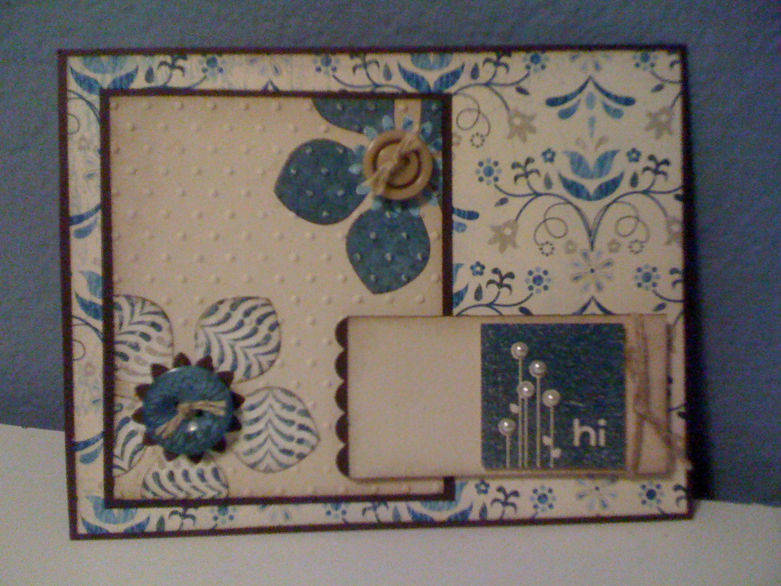
How am I to take all that I love about crafting and deliver it in a single entry? Well, it took a little time (and much ink on my fingers), but I think I have it right. I definitely gravitate toward beautiful paper, inventive and unique punches, and accents which add just the right extra touch – I think this card brings them all together. The layout is fairly basic (another signature aspect of my crafting), but the various components help elevate the overall card: punches “fused” with paper utilizing the Perfect Polka-dots embossing folder, layering of different patterns and textures, sponging (if you have followed my blog, then you know that I LOVE TO SPONGE) to offset the edges, and buttons, pearls and thread to take it over the top.

If you have a few extra moments, browse through some of my past posts and let me know what you think of my previous projects.

Thanks for stopping by.
I’ll be back soon!

Recipe: Say it with Scallops! Stamp set; Natural and Early Espresso cardstock; Blueberry Crisp Designer Series Paper; Early Espresso and Marina Mist classic ink; Boho Flowers, Perfect Petals, Blossom Petal, 1¼“ Square, and Scallop Square punches; Basic Jewels – Pearls; Subtles and Neutrals buttons; Linen thread; Cuddlebug and Perfect Polka-dot embossing folder; sponge; stampin’ dimentionals; mini glue dots.